I want to Clarify My Priorities by breaking down a complex issue.

Causes Diagram

Download

Namahn and Yellow Window Service Design, Design Flanders (2012) Cause Diagram. In: Service design toolkit.


Level of Involvement

Fairly simple, self administered tool, needs relatively less time.


Download Worksheet

English Version

Share It

Tags

What is it & why should I do it?

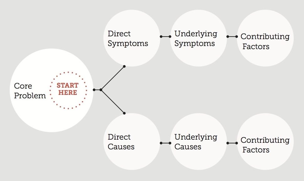
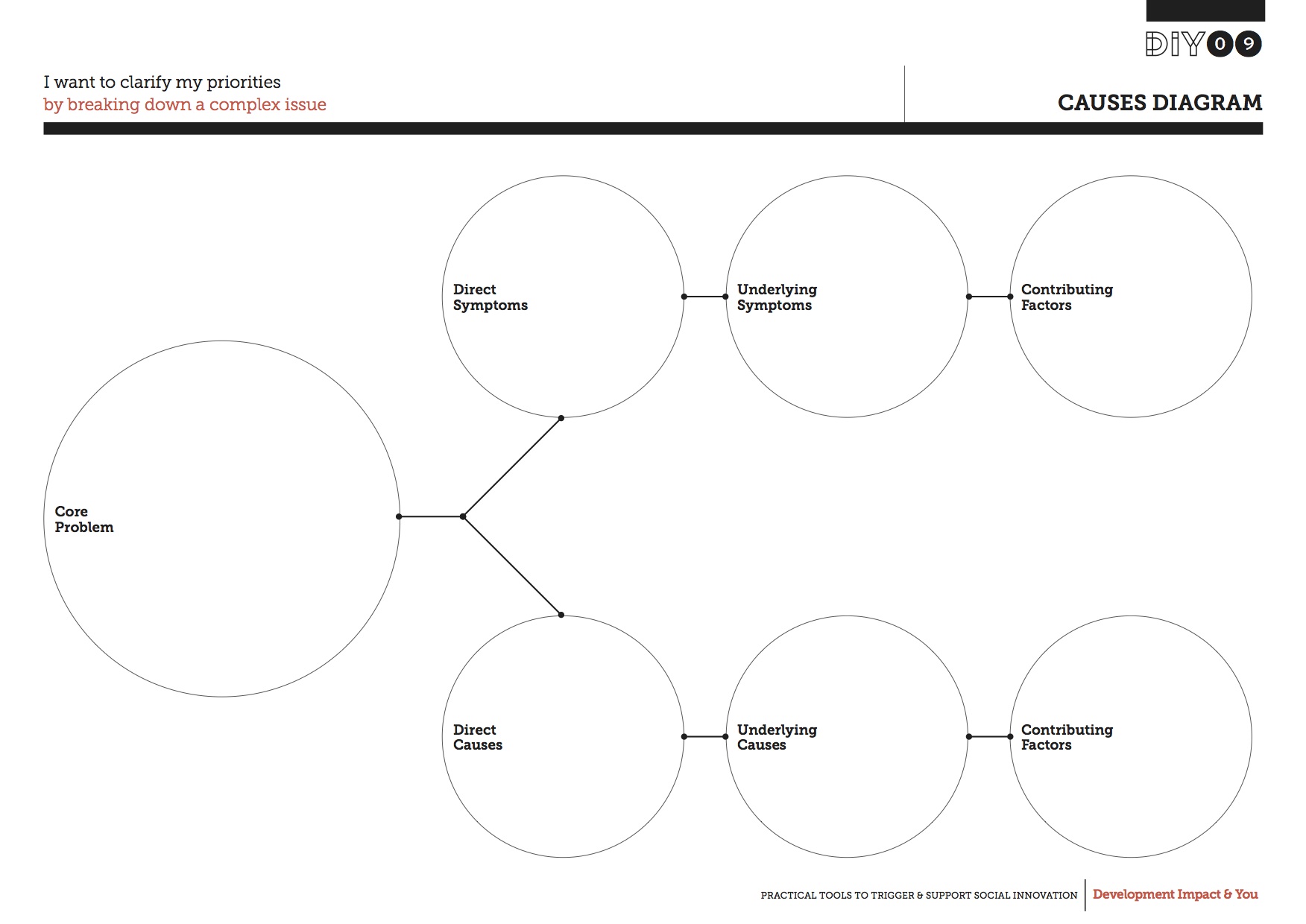
What is the root cause of a problem? Often there isn’t one simple answer. The bigger the problem, the more likely it is that the roots will be widespread, and mapping out the causes can quickly get out of hand, making the problem seem overwhelming.


The Causes Diagram helps you think of a problem in a thorough manner and provides a structured way to analyse it. Its pushes you to deconstruct all possible causes for the problem rather than the obvious ones. You can use it both to analyse a new problem and as a tool to highlight the gaps in an existing problem.


It also helps to differentiate causes from effects or symptoms, giving you a better idea of the solutions needed to solve a problem permanently, and it helps to build a shared understanding of what it is you’re working on.

How do I use it?

Causesb

First, identify and write down the core problem you are trying to resolve in the centre of the worksheet.


Working your way from this starting point, write down the direct, underlying and contributing symptoms you see as a result of it. These may be people involved with the problem, systems, equipment, materials, external forces, etc. Try drawing out as many possible factors as possible.


Now fill out the causes that correspond to these symptoms. Once the worksheet has been filled out, go through each symptom and cause with your team and consider if they are correctly placed, and discuss what you can learn from this in terms of clarifying your aims.


Be careful to not mix the causes of a problem with its symptoms as you note these down – a cause is the reason why something happens, while a symptom is usually what we see as the end result of the problem.


Key source of inspiration:

Namahn and Yellow Window Service Design,Design Flanders (2012) Cause Diagram. In:Service design toolkit.

Available online from: http://www.servicedesigntoolkit.org/assets/posters/workposter_causediagram_a1.pdf