I want to Know the People I'm Working With by clarifying relationships between stakeholders.

People & Connections Map

Download

Namahn and Yellow Window Service Design, Design Flanders (2012) Stakeholder Mapping. In: Service design toolkit.


Level of Involvement

More complex tool that should ideally be done over a few days. Given the strategic nature of the inputs/outputs, this needs consultations with seniors, peers and ideally needs to be revised after a first pass.


Download Worksheet

English Version

Share It

What is it & why should I do it?

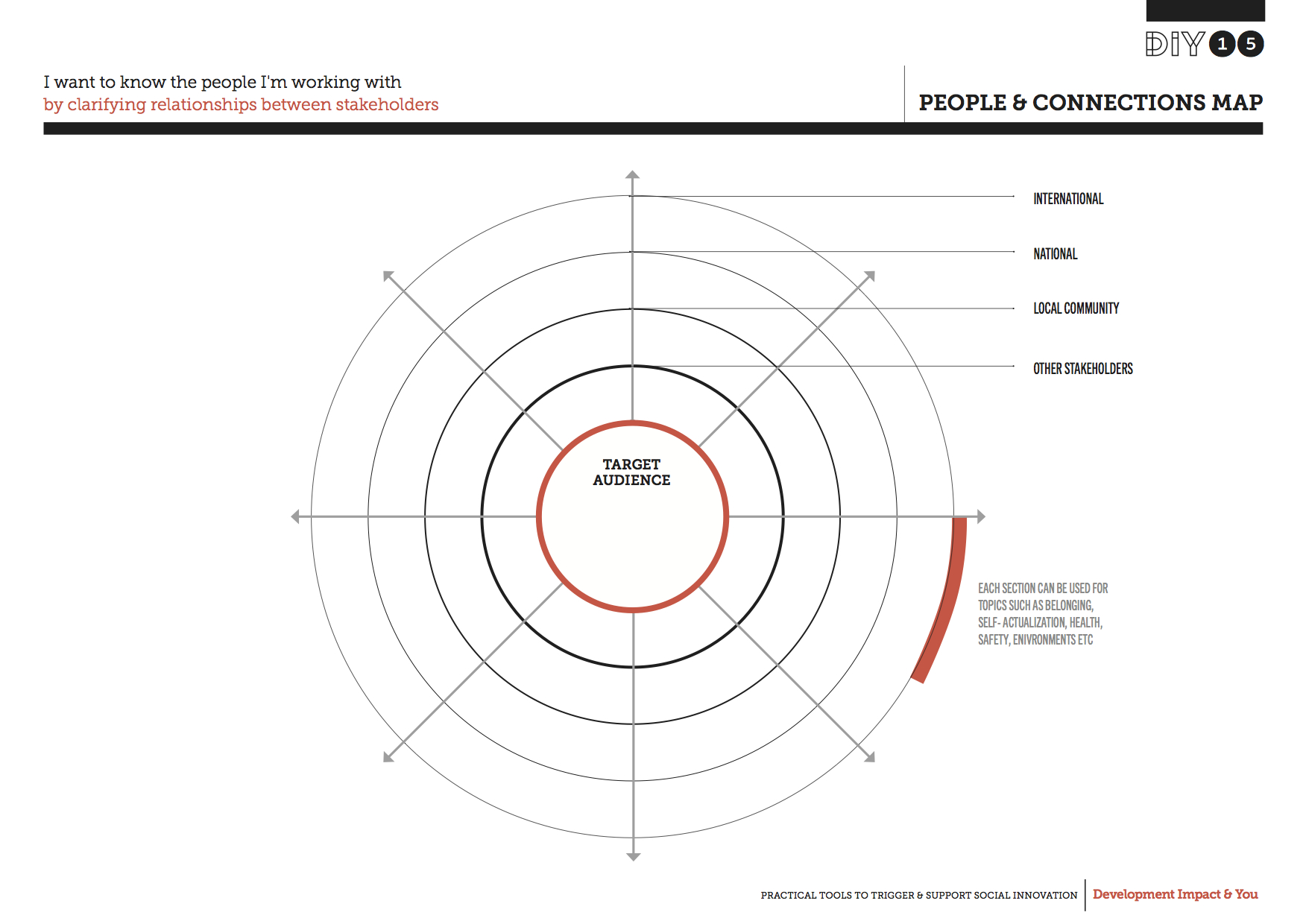
The People & Connections Map is a quick and simple way to visualise exactly who you are trying to reach and how. It gives you an overview of all the different individuals and organisations involved in what you do. It allows you to develop a clearer picture of how all the different people and organisations relate both to your work and each other. These might include the people or communities you work directly with; the various bodies from which you receive (or are seeking) funding; or your own peers, local communities and even international support networks.


The People & Connections Map can be a great resource when sharing what you do and how it links together within the community of stakeholders that surround you. This tool is based on the original Stakeholder Spidergram developed by the Helsinki Design Lab, and further inspired by the Stakeholder Mapping tool by Namahn and Yellow Window.

How do I use it?

People and Connections Map-htu

Start by noting down your target audience, including beneficiaries, users or customers who would benefit from your work, in the centre of the worksheet. Then work your way from the centre towards the outer layers, mapping other people and organisations that are related to the work you do. These could be people and organisations that are responsible alongside you for implementing or delivering your work.


By organising the people and organisations that are related to your work across the concentric circles, you can indicate who of them are closer or farther away from the target audience. The closer to the core, the more local they are. The closer to the outside, the farther away they are.


In addition it helps to further organise the people and organisations on the map by clustering them in sections that express specific networks, sectors or interest areas. For instance a section with all the people and organisations involved with health, safety, environment, or education. Choose sections that are relevant to your situation.
Once the worksheet has been filled, go through each person and organisation on the map with your team and, if necessary, reposition them into the circle and section that the team agrees fits most. This review will give you a useful starting point to discuss which relationships or connections are key, and which may need extra attention. By clearly marking out these fields in the map you can highlight and communicate the main focus for your work.


Key source of inspiration:

Namahn and Yellow Window Service Design,Design Flanders (2012) Stakeholder Mapping.In: Service design toolkit.

Available online from: http://www.servicedesigntoolkit.org/assets/posters/workposter_stakeholdermapping_a1.pdf